Idea
Create from scratch
Besides the simple goal of creating a product page, we also wanted to create some kind of template for future products and packaging similar to the BA project.
The idea was simple: we needed a very transparent and usable microsite.
Logic
One small step at the time
The product website should be transparent, easy to understand, and quick to navigate.
To achieve this, we need to provide data very clearly. The strategy is to provide data in small chunks and take action in small steps.
To realize this idea, I decided to "divide" the entire content.
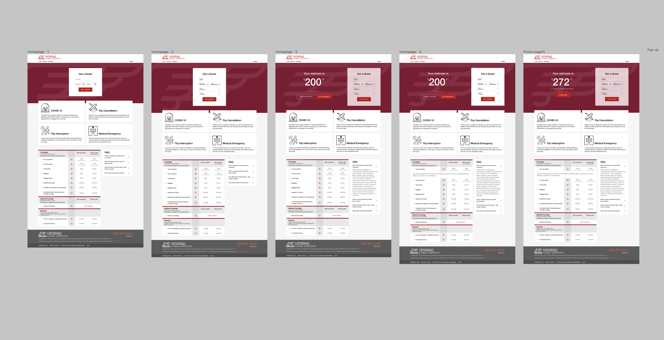
This page will include a section for quotes, a section with coverage examples, and another section with full coverage disclosure.
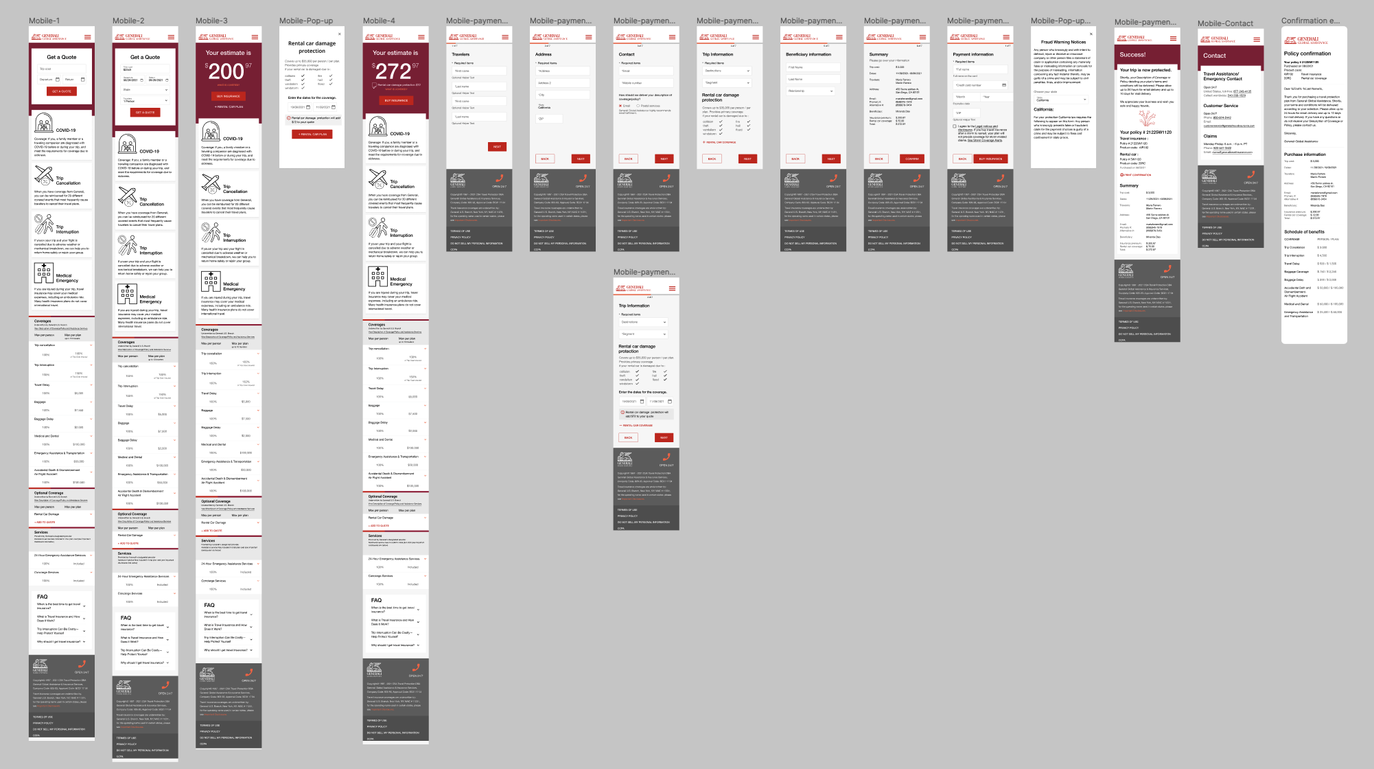
Additionally, the checkout process is broken down into small steps to make it easier for you to focus on one small action at a time.
Design
Balance and creativity
Every design is based on the principle of balance.
The human brain loves structure, subconsciously we perceive more details about our surroundings, other people and art than we think.
Years of user testing have proven that properly aligned web designs are considered much more aesthetically pleasing and professional.
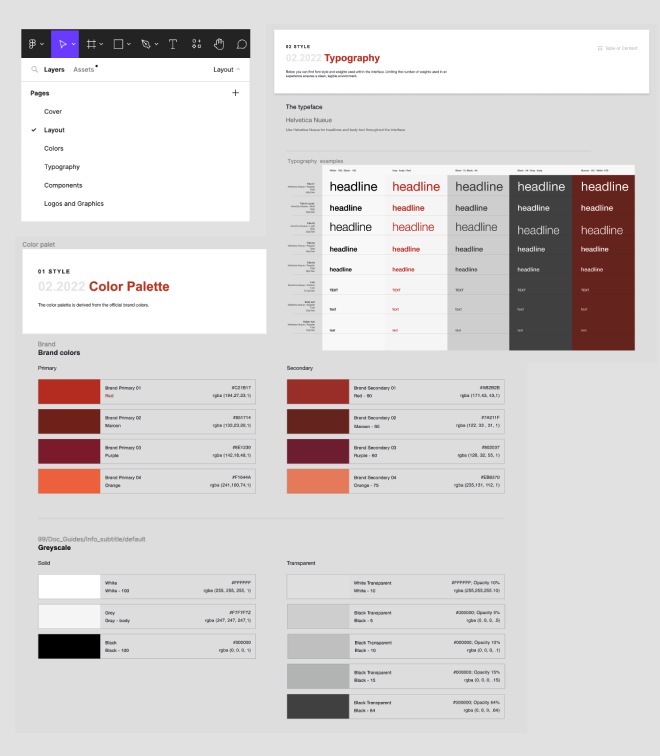
The basis of the design is formed in the GGA-BA style guide, which shows rules about: layouts, colors, typography, including exclusive components and graphics.
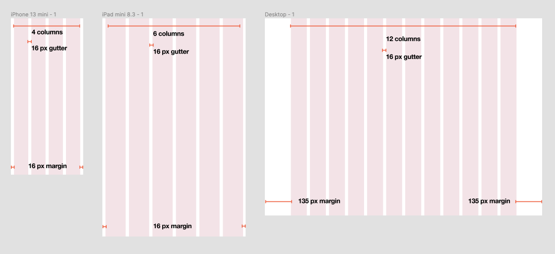
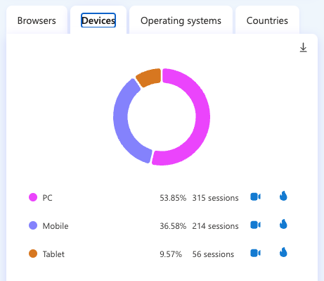
Based on data received from our B2C team, users' preferred screen for browsing and purchasing travel insurance is almost evenly split between desktop and mobile, with Tablets, although designed, will be a secondary priority.
Mobile design
Desktop design

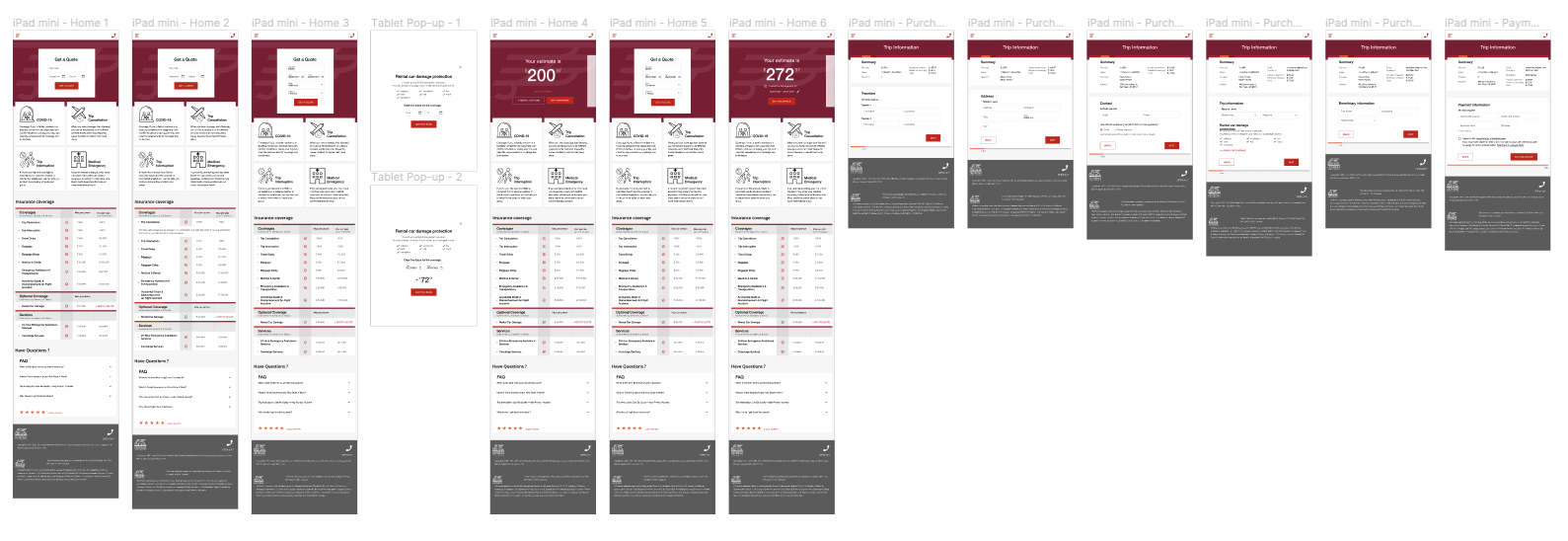
Tablet design
Result
1st milestone
Once design and development were complete, we had the opportunity to connect Microsoft Clarity to this web service and start tracking user actions to determine if we were actually achieving our goals.
- We confirm that desktop and mobile are the right choice for users.
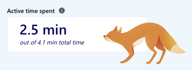
- The idea of quick service is complete. Users spent approximately 2.5 minutes on the web.
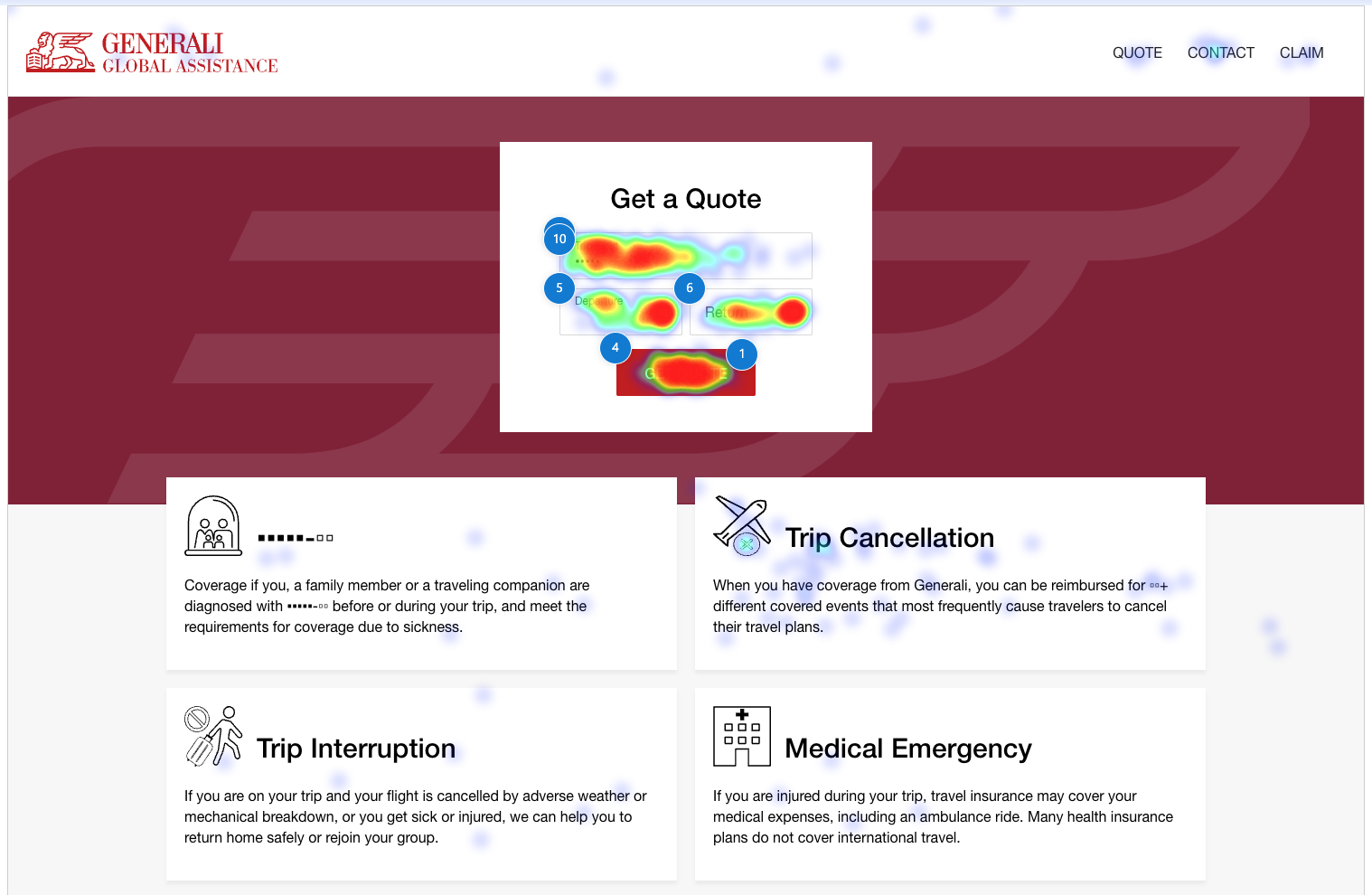
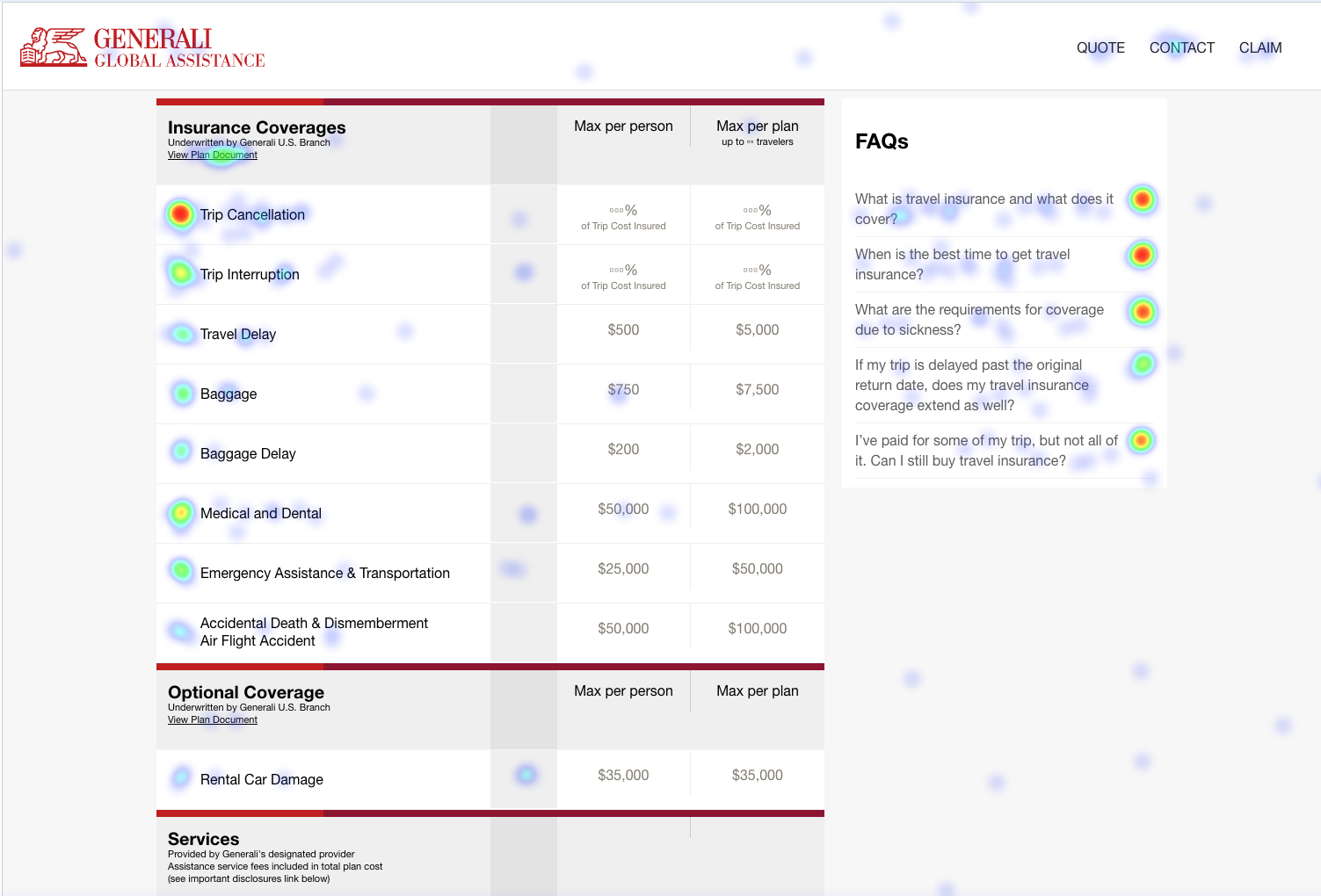
The check out process lasts an average of 5 minutes. - The heat map shows that users click on active elements 90% of the time.Our quote form is the one that attracts the most attention, followed by the accordion with an explanation of coverage.Therefore, it is safe to assume that we are addressing the goal of transparency.
