Idea
To ensure consistency in UI design, a brand must have a well-documented style guide. In Generali’s case, the existing style guide was provided in PDF format and primarily focused on graphic design. However, there was a growing need for a digital version tailored to web requirements, allowing web designers and media designers to reference a unified set of guidelines for a cohesive digital experience.
Furthermore, there was a pressing need to establish a comprehensive library of web elements to ensure design consistency and streamline the workflow for all UI designers. To achieve this, creating a component library document became essential, providing a structured reference for reusable design elements across digital products.
Additionally, two more supporting documents were essential to this project. The first was a research and design decision documentation, capturing the rationale behind key choices. The second was a wireframe elements library, designed to streamline visual logic creation and iteration.
To accommodate different types of design projects, these documents were structured as separate Figma files. For example, graphic designers could leverage the Style Guide document, benefiting from predefined design rules, without needing to interact with the web components library. Meanwhile, UX designers working on new web service functionality could rely solely on the Wireframes document, allowing them to focus on layout and logic without getting distracted by styling details.
This approach ensured that each design discipline had access to the most relevant resources, optimizing efficiency and collaboration.
Style guide
Color palette
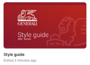
The Style Guide file is designed to be the single source of truth for all aspects of Generali Global Assistance's design work. It provides designers with automated presets for the color palette and typography, ensuring consistency across projects. Additionally, it includes a reference library featuring different versions of the company logo, commonly used icons, and reusable graphics, making it a comprehensive resource for maintaining brand cohesion.
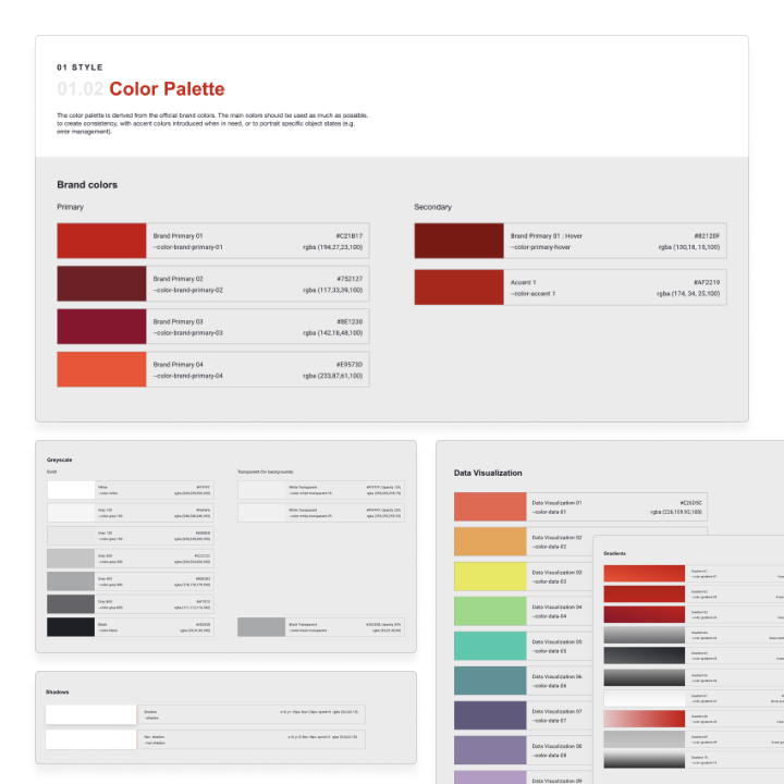
The color palette is traditionally built around the brand’s primary colors. However, to serve as a practical and comprehensive guide, all colors in use should be documented and automatically pre-set for designers. This includes defining neutral colors, such as the specific shades of gray, tints, and shadows used in Generali’s brand identity. Additionally, the Style Guide provides a selection of commonly used gradients and complementary colors, ensuring consistency in illustrations and data visualizations.
Typography
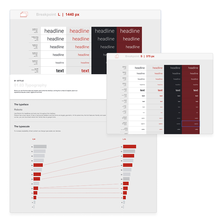
The Typography section of the Style Guide serves as a comprehensive reference for designers, featuring all predefined typography presets to streamline their workflow. Additionally, it offers guidance on optimal color combinations, including recommended background and foreground pairings for accessibility and readability.
This section is designed to provide visual direction to UI designers, particularly in adapting typography sizes for responsive design. By leveraging data on the most common screen sizes and aspect ratios of popular devices, we can refine our design recommendations to create an optimal user experience tailored to Generali users.
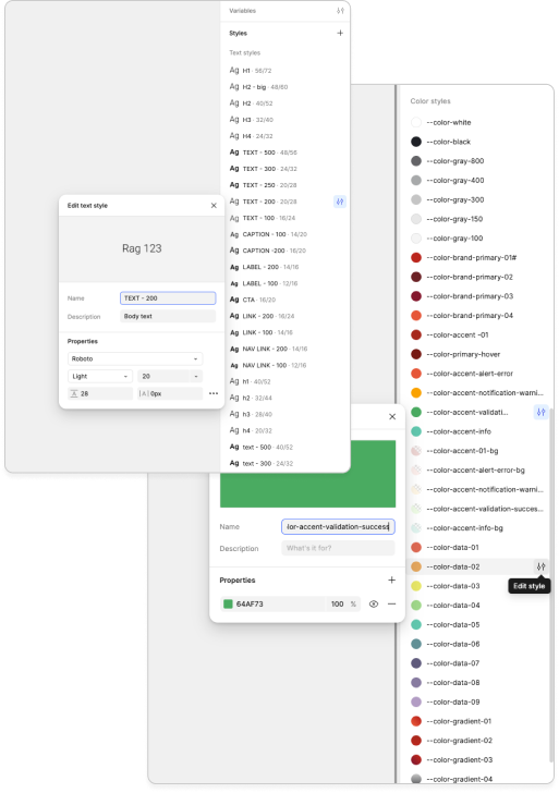
Of course, real magic isn’t possible without technology. Figma greatly enhances design productivity and consistency by enabling the use of automated variables such as typography presets, color presets, and effects like shadows and blurs. While these elements don't create themselves, the time invested by a dedicated designer will pay off thousands — or even millions — of times over!
Additionally, Figma's ability to create and maintain design systems ensures that teams avoid reinventing the wheel with every new project. By setting up a solid foundation early on — through reusable components, tokens, and responsive rules — designers can focus more on innovation and less on repetitive tasks. Over time, this structured approach not only saves countless hours but also strengthens brand consistency across every user touchpoint.
Graphics
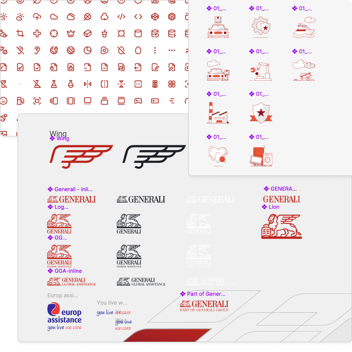
From millions of Adobe Illustrator files to a single, organized digital collection — it’s crucial that all designers know exactly where to find existing resources. And what could be easier than checking just one document? All logos, brand elements, decorative icons, operational icons, and supporting vector elements — including credit card symbols, Google and social media icons, partner logos, and even hand pointers — are now collected and stored in one centralized location.
And yes, each of these elements has been built as a component to ensure easy searchability and seamless application.
Components
From design to assembly and back to design — this is the ongoing process of creating, utilizing, and refining design components. If you use something more than twice, it should become a component. If it’s used more than three times, it must be consistent. Reinventing web elements is not only a waste of valuable time but also a hallmark of poor web design. Consistency and aesthetics are fundamental principles that cannot be overlooked when working to build a recognizable and trustworthy brand.
From a technical standpoint, components serve as the documentation for web elements. Creating these elements saves time not only for designers but also for developers by visually representing all variations, states, and animations of each component. No guesswork is required — developers know exactly what to build, and quality assurance teams know what to expect during testing.
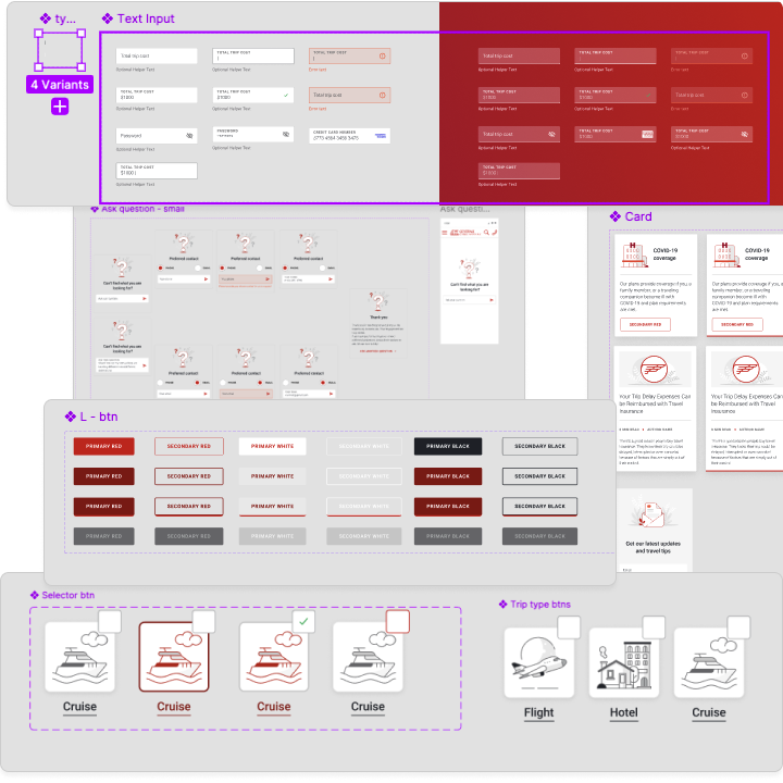
Without a unified brand or style system, even the most talented design team can struggle to deliver consistent, high-quality work. A strong system acts as the backbone of creativity, enabling faster execution, fewer errors, and a stronger, more recognizable brand presence. The value it brings is immeasurable, saving countless hours and ensuring excellence at every touchpoint. I am proud to be the one who built and continues to refine this system, ensuring it evolves alongside our team's needs and the brand’s future.

