Idea
Assesment and research
My first step in updating any of the older projects was to go through the client's website and visually assess the situation. The first step was to take note of the number of pages published on these websites and their relation which were often absent. I would also pay attention to the content which was often missing on some pages other than the home page and the way it was presented. Brand and design relation was the third to consider on my list. I would check brand colors for the web acceptance based on the contrast and saturation.
During this action, I will determine the scope of the update:
- Homepage
- Number of internal pages to update
- Additional pages creation
- Navigation update
- Forms update
- Branding implementation
- Colors update
Logic
Interconnection
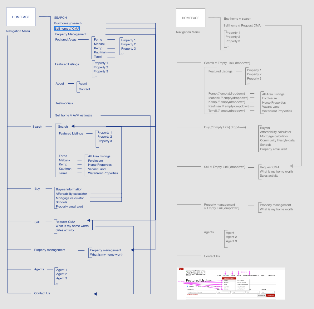
Linn Realty's website content was very direct and with no introduction to familiarize the user with their services. Tools were presented to the user without explanation and what they were for... this has created a very user unfriendly environment. The user was left to figure out how to use the website services. Many pages had Call To Actions(CTA) without any invitation or explanations, other pages had no CTA at all and had created dead-ends in the user journey.
Without a question, this approach wouldn’t support the idea of conversion. I reworked the logic to create a better interconnectivity to increase the possibility for users to engage with the client.
Design
Branding
The main upgrades in design of these types of projects are the proper application of the brand colors and typography.
Unfortunately, many brands do not have a set of brand style guides, and Linn Realty is one of them. In this case, I have to base my start point on "color in use" and cross-reference it with a sample of the logo color.
Both primary and secondary colors were very intense prior to my changes. The primary Red was very high on saturation, and could potentially cause eye fatigue for the web user. I adjusted the saturation level of the color to avoid the potential risk of losing the user due to fatigue. The secondary black color was super contrasted and had no room for the "dark" color option, so I made it several shades lower.
I personally prefer Material Design Guidelines for the color scheme.
Homepage
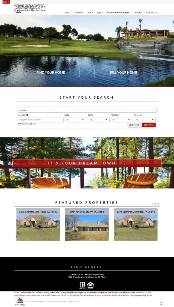
The new home page is created for these projects based on the template combinations from the earlier designed tool, which allows us to speed up the new site homepage creation. We applied the same approach to the sites we redesign. View the tool
The customer service representative passed on to me the screenshot of the home page layout the client picked. I applied proper brand styling, and adjusted the templates to the existing content.
MLS listings display pages before
MLS listings display pages after
Service pages before
Service pages after
Result
Outcome of redesign
We are expecting a better conversion rate as a result of this redesign and so far as client feedback suggests we have achieved it to a good extent.
Here is the summary of what was redesigned for Linn Realty website:
- Application of the brand color
- Color adjustments to prevent visual fatigue
- Consistent typography settings
- Text presentation adjustment for easier cognitive perception
- Forms layout adjustment for easy cognitive perception
- Content adjustment to provide users with directions for website resources usage
- CTA adjustments, each homepage section has CTA, each page has CTA, no dead-end for user journey
- MLS listings display adjustment to improve load speed
- Images adjustments for the faster load time


